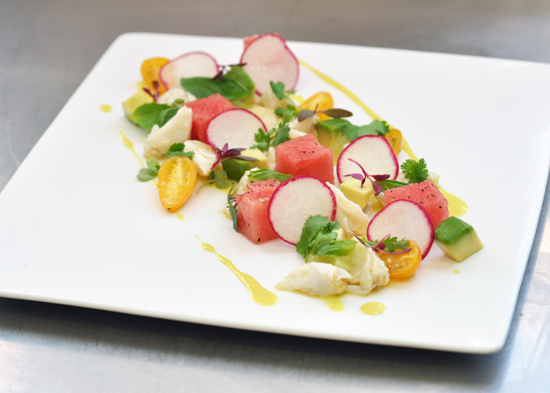
What makes an attractive plate?
Seems like an easy question, but the more you think about the answer, the more complicated it becomes. After all, who's to say what is or isn't attractive? While beauty does lie in 'the eye of the beholder,' there are certainly ways of putting food on to a plate that 'only a mother could love.' This week I decided to take a look at one dish and play with different ways of getting the same ingredients on the plate to see if I could figure out the ultimate answer to "What makes an attractive plate?" To my surprise I found more than one answer. First up, the dish:
Crab Salad with Yellow Curry Cream, Watermelon, Avocado and Lime
It's an ingredient list that satisfies 3 of the 4 benchmarks of a good plate.
There's Color — red, yellow, green and white;
Texture — tender, crisp, creamy, soft;
Flavor — which if I do (humbly) say so myself, was quite good; and the manipulated variable would be
Shape — what form will each ingredient take and how do they land on the plate? If I do it right the result should look too good to eat.
My first look was a dish that follows the vertical food trend started by great chefs like Alfred Portale of Gotham Bar and Grill. Despite being a little dated, this dish has a great look. It arranges the food in a way that encourages the diner to eat the dish with all of the components mixed together, providing the best balance in each bite. Beyond the striking appearance, it's a dish that's easily replicable and well suited for both prepping and plating ahead of time, which makes it a home-run for catering or serving to a large number of guests at one time. Drawbacks: Could be a little intimidating to approach with a fork, may get a little messy to eat.
Next, a plating style that is certainly more approachable. The look of a dish like this reminds me a bit of my time at Daniel. Here the curried coconut cream is transformed from the fluid base of the plate to a gelée that rest between the layers of crab and watermelon. Immediately the plate becomes more interesting as the eye dissects the elements of the plate and takes them in again as a whole. The look is very clean with plenty of negative (empty) space on the plate to draw focus to the food. Drawbacks: Handling sheets of yellow curry cream is no easy task — it requires a delicate touch and a little know how. It would be a difficult dish to pull off in a high volume setting.
The final look is my personal favorite. It borrows from the most modern approach plating, a bit deconstructionist. It's the kind of food I associate with chefs like Rene Redzepi from Noma. Though I would never dare compare my food to his, let's just say it's a dish inspired by. When a dish is presented with all of its elements separated, a lot of power lies in the fork of the diner (which may or may not be a good thing). Here the diner has the ability to experience the different elements of the dish however they choose; which puts a lot of pressure on the chef to make sure each piece is perfectly seasoned and balanced. To me, this style of presentation allows each ingredient to shine with it's own natural beauty. No manipulating, no fuss... except for the hours that go into perfecting each knife cut and every step of seasoning. Drawbacks: Tiii-iiii-iii-iime is not on your side. There's a lot of work that goes into making a dish like this. It's labor intensive and doesn't have many elements that can be prepped ahead.


